The ingredients for the Bomat catalogue were there: an established visual identity with selected fonts and colours, photo material and use of ‘cutout’ shapes.
For the new catalogue, ZZeen set up a new grid with a clear layout and refined details.
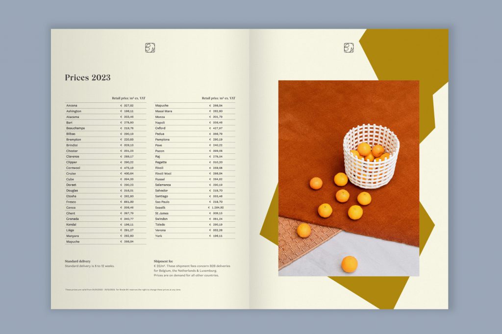
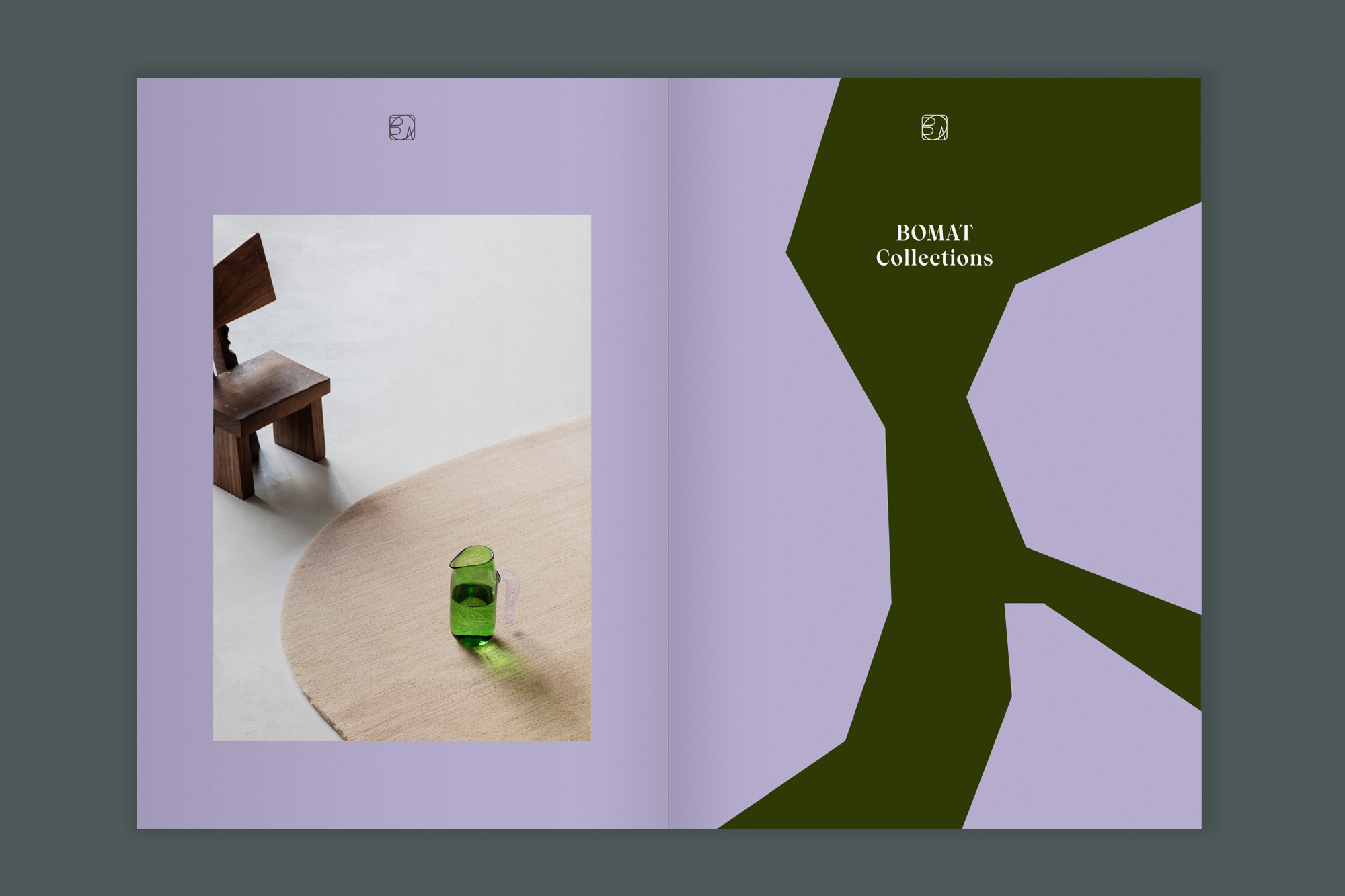
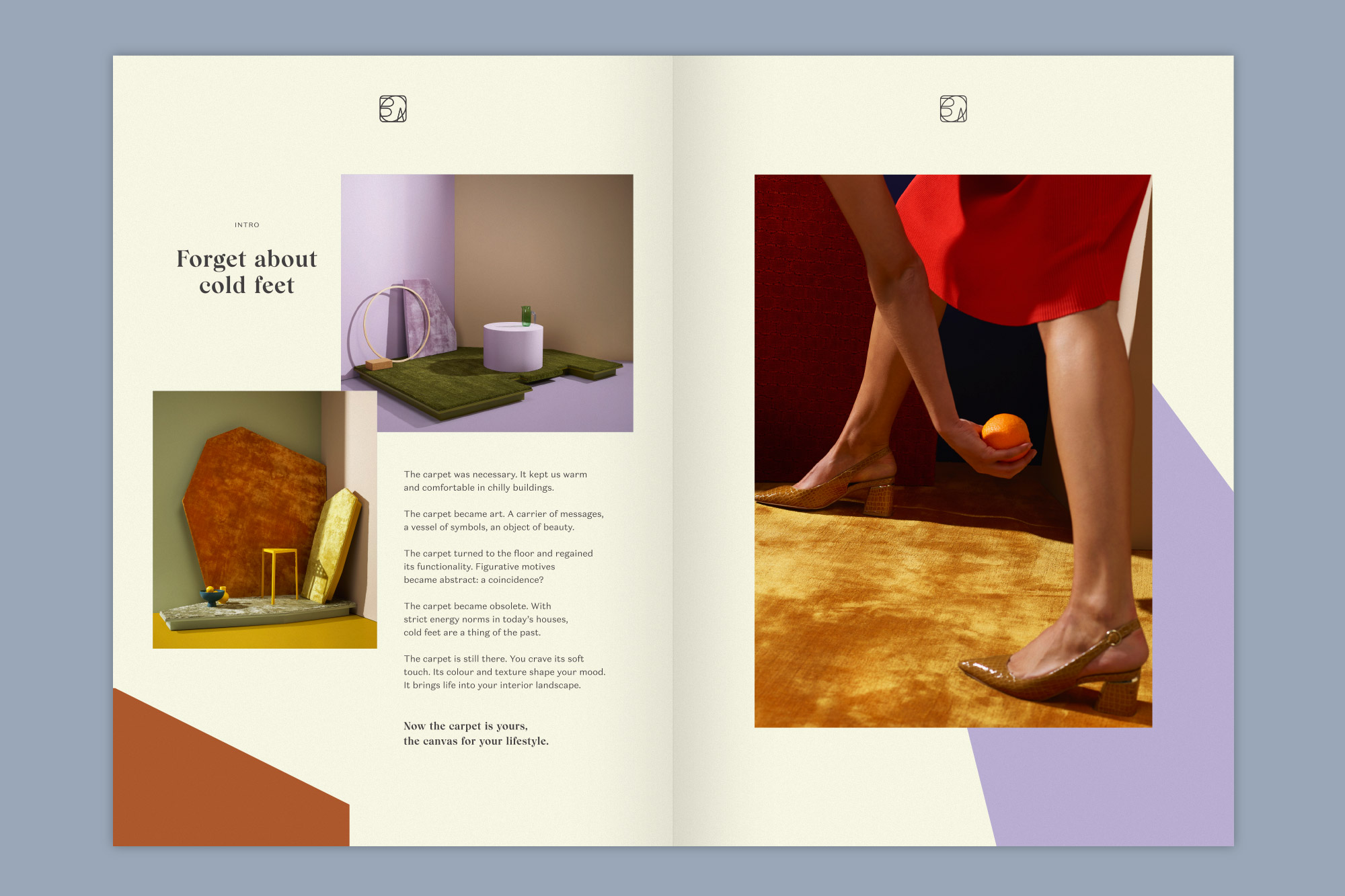
The first pages are an introduction to the company and its products, and were used as a statement, with more freedom and bold use of images and the coloured cutout shapes.
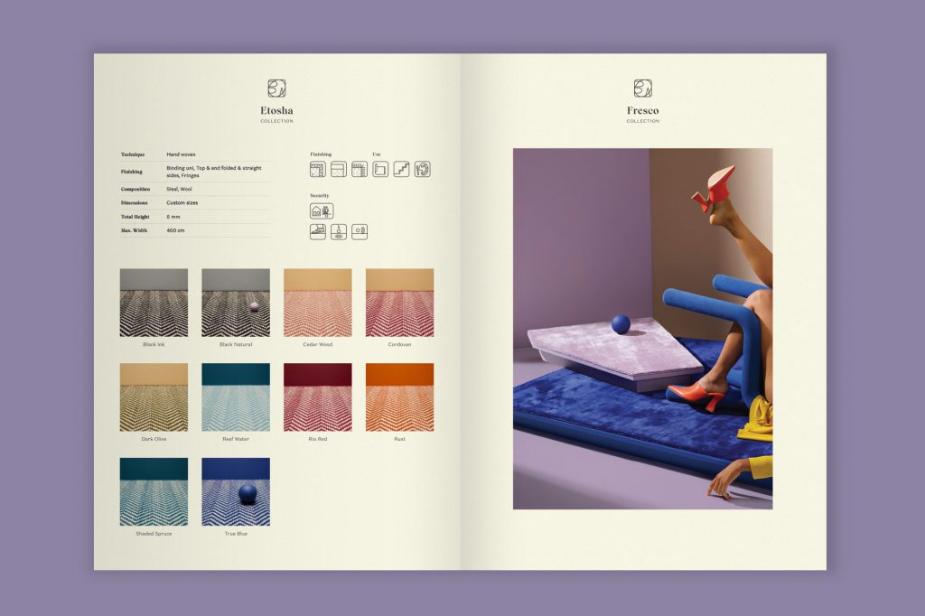
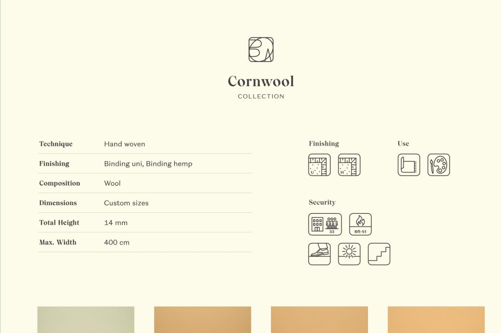
For the product pages, ZZeen created a new set of icons with optimised consistency and a fresher, modern look. The product pages feature a clear layout which helps users find every detail as easy as possible.
The end product is both well suited for daily use and a clear statement of the Bomat brand.