
Chicken restaurants have existed forever. However, this one is a little different. The owners have paid attention to every detail, from the dishes to the interior to the communication.
They wanted a modern but cosy restaurant, with a warm glow. We started with the logo, which has a distinct vintage feeling to it, like a tribute to the chicken restaurants of yesterday.
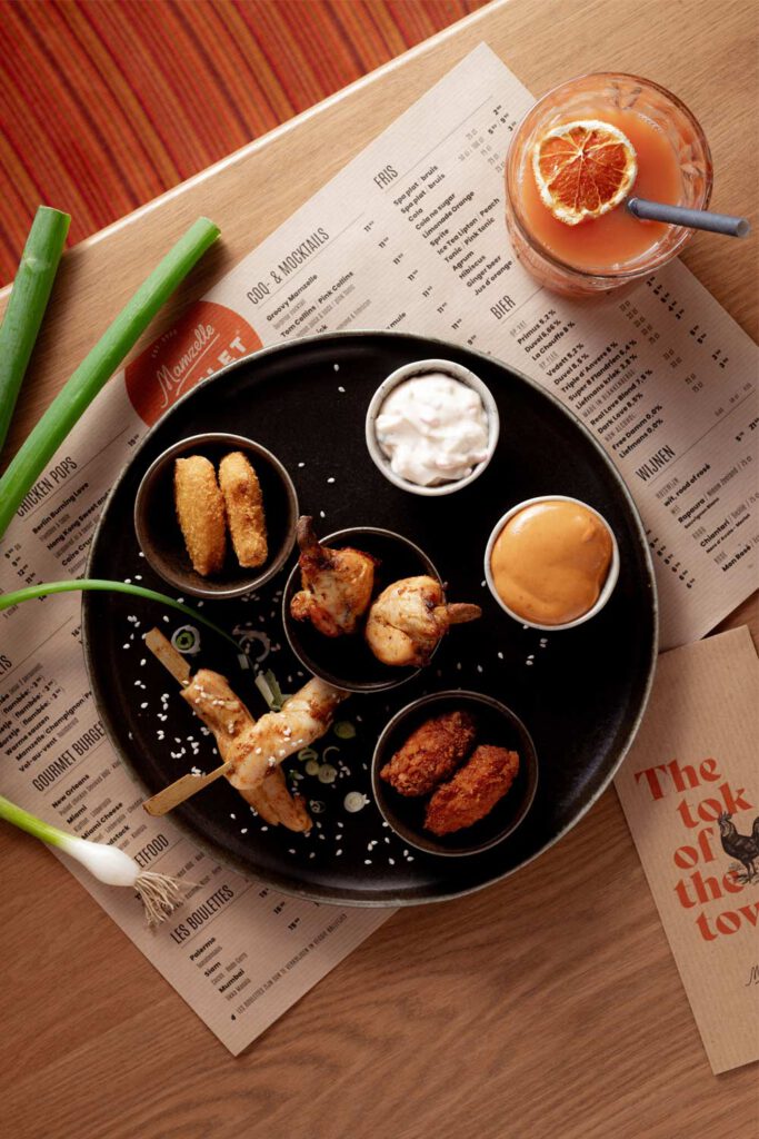
Then we added lots of orange, inserted more flavour with vintage chicken drawings and topped it of with tasty typography.
With these ingredients ZZeen designed a wide range of applications, including menus, folders, gift cards, wall decorations, a website and lots more. (Yes, even a faux stained glass holy chicken window).


